
Do you know your participants? Each time a participant launches a study on Gorilla, we collect some basic information about the equipment they are using and their location. We have collated and analysed summary statistics on around 200,000 participants whose data was included in a data download after taking part in a study on the platform.
If you run studies online, or are planning to in the near future, this article will tell you — through descriptive data — about the equipment that your participants are likely to be using, and hint at the demographics you may have access to.
The results are also published in our paper: Realistic precision and accuracy of online experiment platforms, web browsers, and devices.
Table of Contents [Show]
What do you need help with at the moment?
Devices
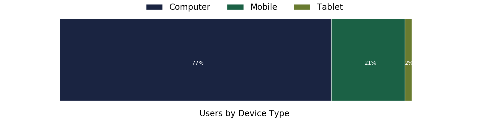
The vast majority of participants use a computer (Desktop or Laptop). Note this does not add to 100% due to some devices not enabling logging on their browsers.
Participants accessed Gorilla and completed experiments using over 1100 different devices, ranging from Desktop Computers to touch-screen mp3 players — and even 11 Xbox users. This shows the strength of Gorilla as a flexible platform, as researchers do not have to adapt their tasks to work on a massive range of devices — the task builder sorts this out for you.

Smartphones accounted for 20% of our users. The most popular smartphone devices for participants were the iPhone, followed by Samsung range and then by Huawei devices. We can compare this to information from StatsCounter which collects user data from over 10 billion page views every month. Relative to this broader market Gorilla Participants are much more likely to be using an Apple phone (54% vs 22%), this is likely representative of the consumer markets participants are located in (more on this below).

The relatively small number of tablet users was dominated by iPads, followed by Samsung users. The others amounted to an almost negligible number. This is likely a biased sample, as it is so small.
The dominance of desktop/laptop may reflect the desire of researchers concerned with precision timing and consistency across participants using the Requirements feature in Gorilla to limit participants to Computers (Desktops and Laptops). A screenshot of this can be seen below.
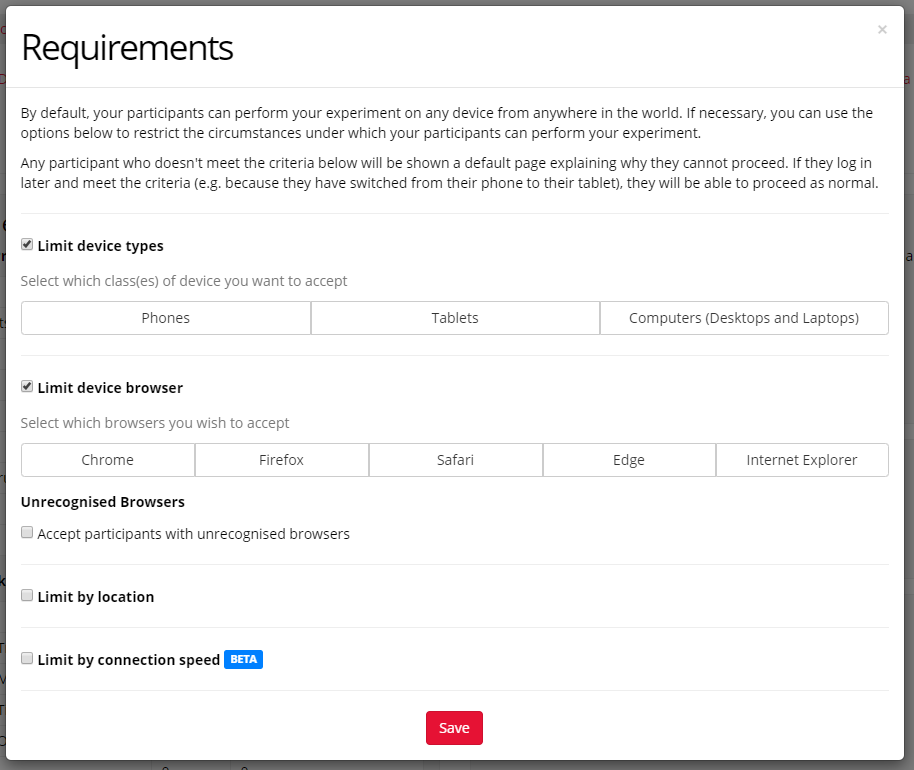
Gorilla.sc has built in tools to limit participants by browser or device. This will help control your data quality.
The massive variety we see in user’s devices really outlines the importance of (1) using the browser testing tools to check the appearance on a range of devices, or (2) applying a requirement in order to limit your participants to a specific device or browser.
Browsers
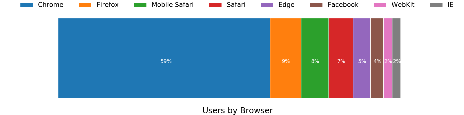
Note this does not add to 100% due to some devices not enabling logging on their browsers.
We can see a heterogeneity of browsers here. Chrome, by far, is the most common — which is in line with globally reported trends on usage (64% used Chrome) from StatsCounter.
We now see that more participants are accessing experiments using the Facebook app browser than they are accessing with internet explorer. This is likely a reflection that researchers commonly advertise their research on Facebook groups — participants are highly likely to click on those links on the mobile app (which uses this browser). The percentage of users using the Facebook browser (4%) is much higher than the broader user stats linked to above.
This also outlines the decline of Internet Explorer which is at 2% of our samples, with Edge being ahead. Also, note that more participants are using the mobile version of Safari than the local version. WebKit is the mobile Safari browser but used on other devices (e.g. Kindle’s use WebKit).
Operating Systems
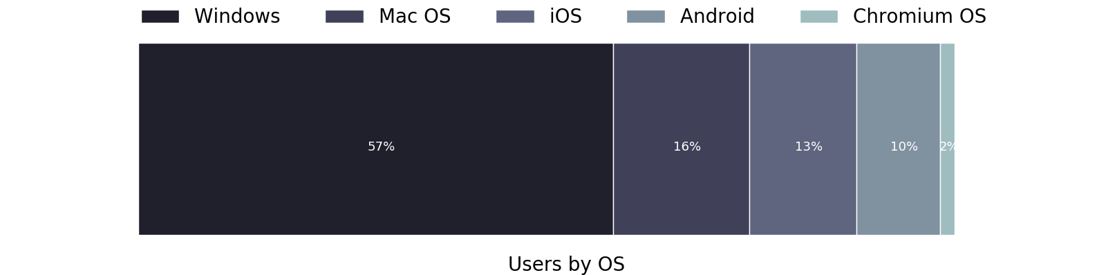
Predictably, Windows remains the dominant OS in use. Comparing this again to stats from StatCounter, we can see that, overall, our participants are more likely to use some form of Laptop/Desktop over a mobile device than the average world user, and are more likely to use macOS than the average world user. This probably reflects the requirement of being an online participant (easier on a personal computer), and the western device market (more Macs).
Recruitment Platforms
There are a variety of ways that you can recruit participants to take part in a study on Gorilla. The most straightforward one is a simple link that can be shared however you please (online, on posters, via email). Many researchers are motivated to take their research online in order to use a recruitment service (e.g. Prolific, mTurk, Qualtrics Panels, SONA, etc) to source participants.
You can see from the graph below, that using recruitment services accounts for 53% of participants, the other 43% come from simple links, whereas 3% are under a pilot recruitment policy. This policy is often used to pilot tasks before sending them out into the wilderness.

About 1% of participants are using the more niche requirements policies. For instance, supervised (which create a unique log in code for each participant) and is often used in classrooms.
Distribution of users recruiting via mTurk vs Prolific
MTurk and Prolific are the most common recruitment platforms in use. They both have pre-qualified participants/workers who are paid to take part in research. Within the recruitment platform, these participants follow a link to a study hosted on Gorilla. Gorilla then hosts the experiments and captures the data. A completion verification process then allows the participant to collect their reimbursement.

Comparing the two popular recruitment platforms we can see that the geographic distribution of participants recruited onto Gorilla is different. The majority of Prolific participants are within Europe, with almost a third in America, and a much smaller number in Australia, Africa, and Asia. MTurk participants are overwhelmingly likely to be from America, with a much higher number located in Africa or Asia relative to Prolific.
This data signifies the importance of choosing your recruitment platform carefully, depending on who you wish to be represented in your research. Both mTurk and Prolific allow you to specify your target location, however, within each platform this is likely to effect your uptake rate and potentially your total sample size.
Locations
Continent
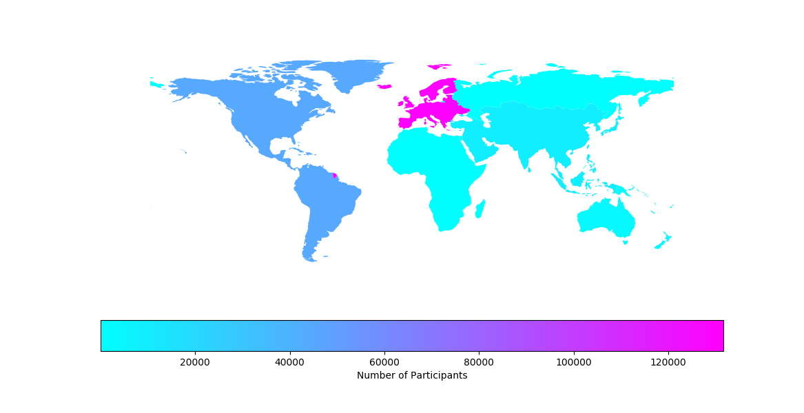
The participants recruited on Gorilla are mainly based in Europe, followed by America, then Asia, and then Australia.
Timezone
This is also reflected in the users by city timezone:

It’s worth noting that the ‘cities’ recorded in the timezone browser data are likely to be course — e.g. ‘London’ represents the timezone that covers the entirety of the United Kingdom as well Portugal and the west coast of Africa. In the United States, Chicago, New York, and Los Angeles are likely to represent different times and cover large areas in the U.S.
This geographic distribution probably goes part of the way to explaining why our user’s devices and brands are so departed from the broad internet user population. For instance, when we look at UK internet users, the most common mobile device is an Apple phone.
In order to access any given population, The Gorilla Experiment Builder allows you to define which locations you want to restrict your users to.
Screen Size
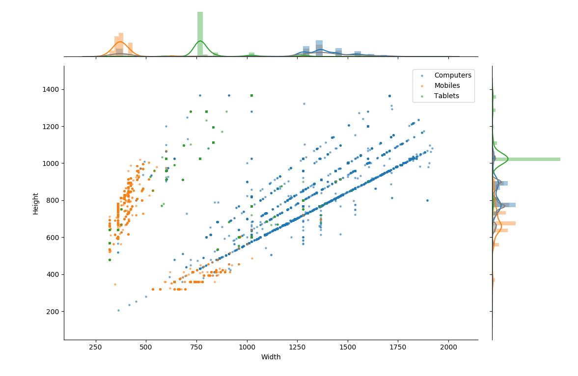
The 99th percentile of Device screen dimensions. Kerned Density Plots & histograms with bin widths of 30 pixels shown for each axis.
Through the use of our logging tools, Gorilla is able to detect the screen size users are using. Of interest to researchers is the variance of screen dimensions we recorded. These ranged from 320×205 pixels to 2800×5982 pixels. The graph above had to be filtered to the 99th quantile to get rid of these extremes — otherwise it was very difficult to interpret.
The clustering of points along diagonal lines indicates the common aspect ratio for monitors, the most common by far (indicated by the lower blue line above) is the 16:9 aspect ratio.
The orange/mobile points appear to be in two diagonal clusters, this represents participants with landscape vs portrait orientations.
The width of screens is relatively distinct for each device type, whereas the height seems to be more closely grouped. This likely represents the mix between portrait and landscape use for mobiles and tablets — which is less common than in computer users.
This variance outlines the importance of thinking about participant screen dimensions in your online research — especially if you are running tasks that would normally be done on a specified monitor in a lab setting. Gorilla allows this by restricting by device type — Computers will be much better for these types of research.
Browser Window Coverage
The browser window refers to the space in which the browser has to display content. This can vary a lot, as users may not put their browser in full screen, or maximise the window. To try and capture this variance we calculated the percentage of each participant’s screen that was covered by the browser window.
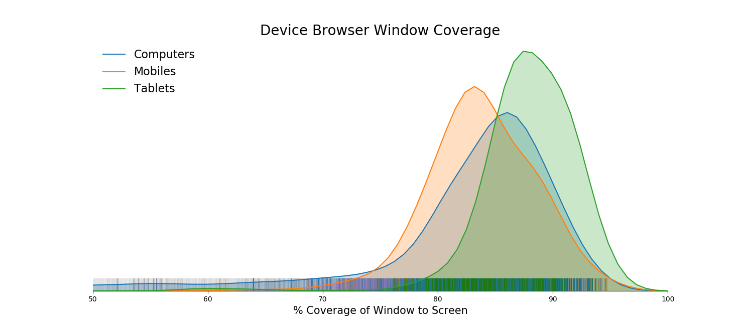
Kernel Density Estimation for each devices’ viewport coverage on the screen. Binned with a width of 2%. The lines above the X axis shows individual participant’s points for reference.
Rather reassuringly the coverage was, on average, relatively high. Participants had a mean of 81% coverage, with a standard deviation of 11%. This means that most participants have a large amount of the screen covered by the Gorilla experiment.
Computers have much more variable coverage, as you can see by the tail in the graph above. The standard deviation of computers was 11% coverage, compared with 6% for mobile and tablets. Although, this is obviously because these devices have a limited ability to shrink windows within them.
A note about graphs
If you’re into that kinda thing, the graphs were constructed in Python using:
Alex is a part-time Developer at Gorilla and a PhD student at the MRC Cognition and Brain Science in Cambridge. He helps build concepts for new features, runs scientific validation on the platform, writes up results and helps experimenters create some of the more complex online experiments.
Alex’s PhD — supervised by Dr Duncan Astle — is on the development of resilience in children, and how this can be modelled through brain scans and big-data methodologies.
Date Published: 9th Feb 2021
Alex Anywl-Irvine
